Dashboard
Data Studio lets you visualize your data with the number fo highly configurable charts and tables, which you can add to dashboards and then customize as needed. The Visualization Dashboard provides an at-a-glance view of the selected visualization charts. The dashboard is customizable and can be organized in the most effective way to help you understand complex relationships in your data and can be used to create engaging and easy-to-understand reports.
The generated reports are interactive and can be shared with the collaborators. You can easily communicate and act on the customized data where all the members of your team can compare, filter and organize the exact data they need on the fly, in one report.
Saving a Chart
In order to add a visualization to your dashboard, you first need to save it under the desired dashboard name.
In order to do that, click on the Save option present beside Run Query option.
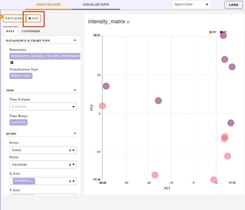
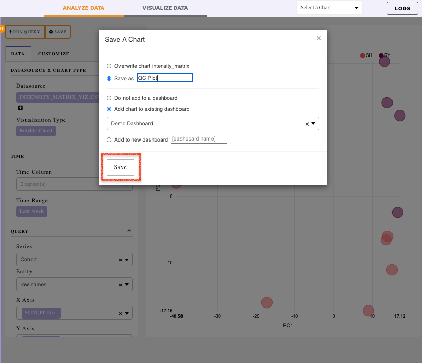
It will display a menu:
-
Overwrite chart cohort: Chart would get saved with the default name
-
Save as: Specify the name of your chart using this option
-
Add the chart to an existing dashboard: Use the drop-down menu to select an existing dashboard. The chart will get added to the selected dashboard
-
Add to new dashboard: Provide a new name of the dashboard and a new dashboard with the current chart will be created
Once all the selections are done, click on Save.
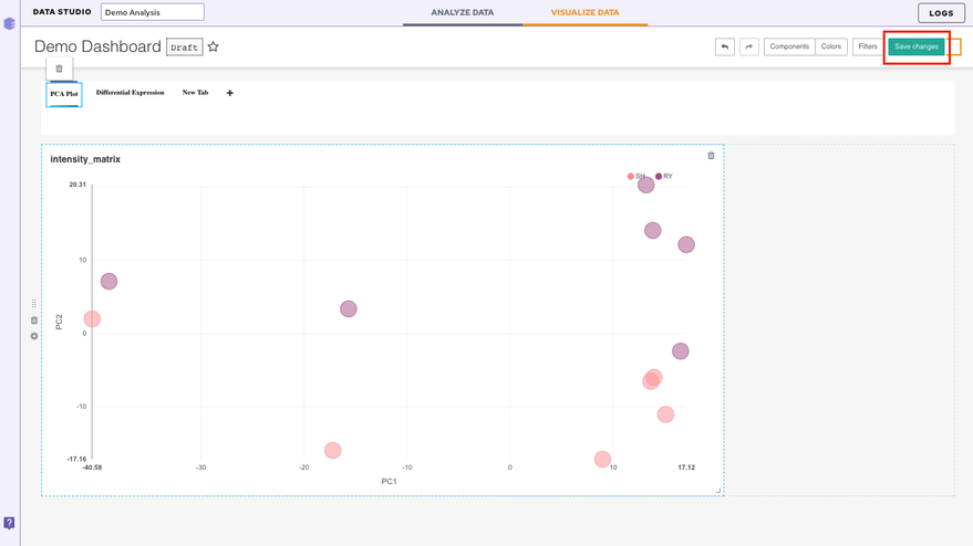
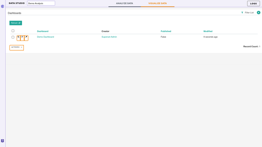
Visualizing the Dashboard
Click on the Visualize Data tab.
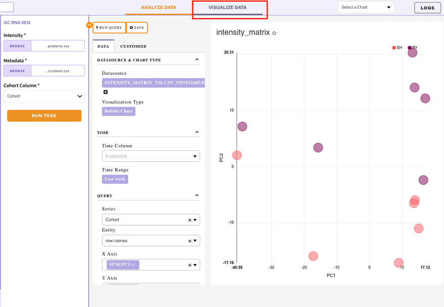
It will display the list of all your created dashboards. Select a dashboard to look at the added visualization charts.
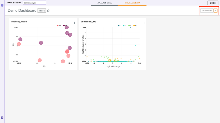
Editing a dashboard
In order to edit your dashboard, click on the Edit Dashboard option present at the top right corner.
There are a few ways to edit the dashboard
- Resizing the table/charts: By selecting the bottom right-hand corner of the table/chart (the cursor will change too), you can resize it by dragging and dropping.
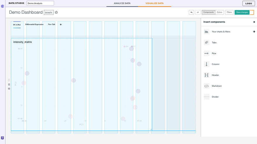
Inserting a Component
-
Your charts and filters: You can use this tab to sort your charts
-
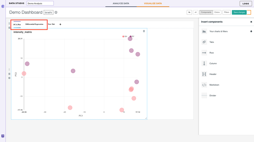
Tabs: This option lets you create different tabs within the same dashboard
Let's say you have two plots in your dashboard. After you insert the component, just drag and drop the two charts. Once the two charts have been separated, label the tabs with the corresponding dataset names (or any desired name) represented in the charts.
-
Column: Lets you add an additional column in the dashboard
-
Row: Lets you add an additional row in the dashboard
-
Header: Lets you add a header to the dashboard
-
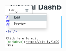
Markdown: In this section, we will add some text to our dashboard. Within the Insert components pane, drag and drop a Markdownbox on the dashboard. Now to edit the text, select the box. You can enter text in markdown format (see this Markdown Cheatsheet for more information about this format). You can toggle between Edit and Preview using the menu on the top of the box.
- Divider: Use this to divide different sections of your dashboard
Note:
- Look for the blue lines which indicate the anchor where the box will go.
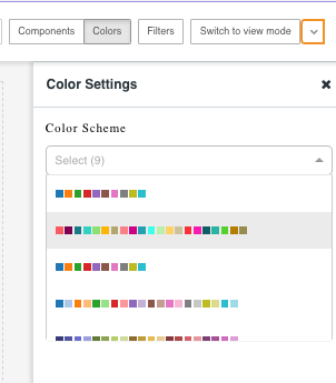
Color
The color tabs let you choose the color scheme from the 9 default schemes present in the dropdown.
Finally, save your changes by selecting Save changes on the top right.